Printed splashbacks are one of the easiest ways to turn a practical kitchen surface into a real design feature. They protect the wall from splashes and heat while allowing you to add personality through images, patterns, or artwork.
However, the final result depends heavily on image size, crop, and print quality. A beautiful photo can look disappointing if it is stretched, pixelated, or cropped in the wrong place.
Understanding image resolution and sizing
When ordering printed splashbacks, the most important technical detail is resolution. Resolution is what determines whether the image looks sharp when printed at a large size.
A common mistake is choosing an image that looks good on a phone screen but is too small for a wall panel. Screens hide flaws, while printed panels reveal softness, blur, and compression.
For best results, use a high resolution original image rather than something downloaded from social media. If the supplier offers a template, always use it to check the exact panel dimensions before you upload your design.
It is also important to consider how many panels are being printed. A long wall behind a worktop may require multiple sections, so the image must be prepared to align across joins.
Ask your supplier what file types they prefer. Many companies accept high quality JPG, PNG, or PDF files, but the key is that the image should be large enough and not heavily compressed.
Choosing the right crop for the kitchen layout
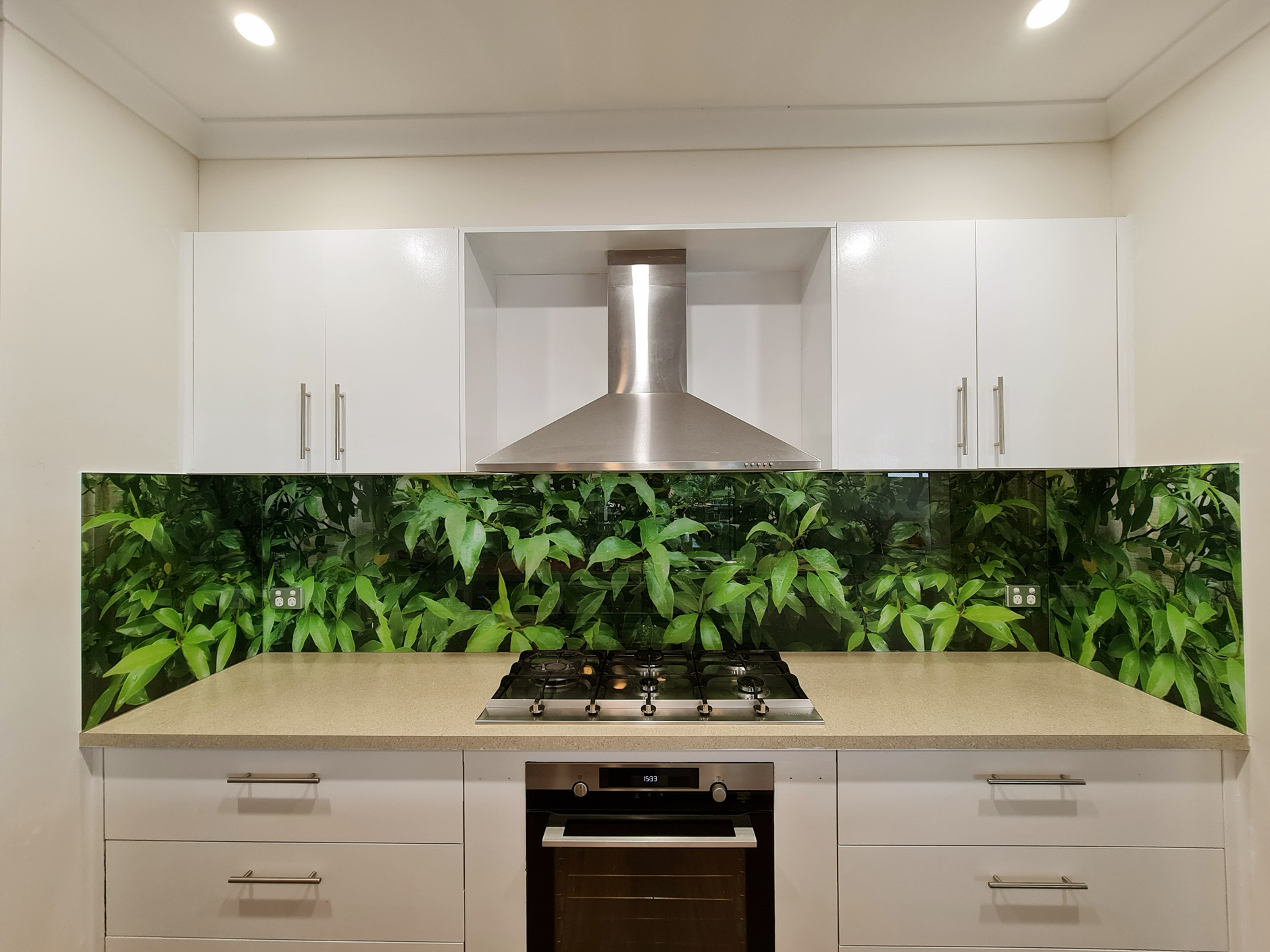
Crop is not only a design choice, it is also a practical one. Kitchens have sockets, switches, extractor hoods, and wall cabinets that can block parts of the image.
Before finalising printed splashbacks, mark out the positions of these features. This helps you avoid placing important details like faces, text, or focal points behind a plug socket.
Think about what part of the image should be most visible at eye level. The centre of the panel is usually the area people notice most, so it should contain the most attractive part of the picture.
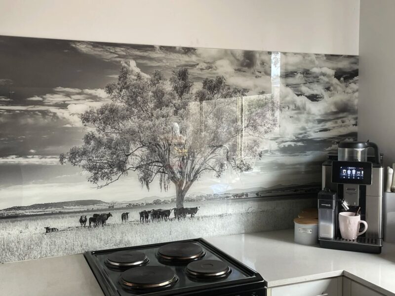
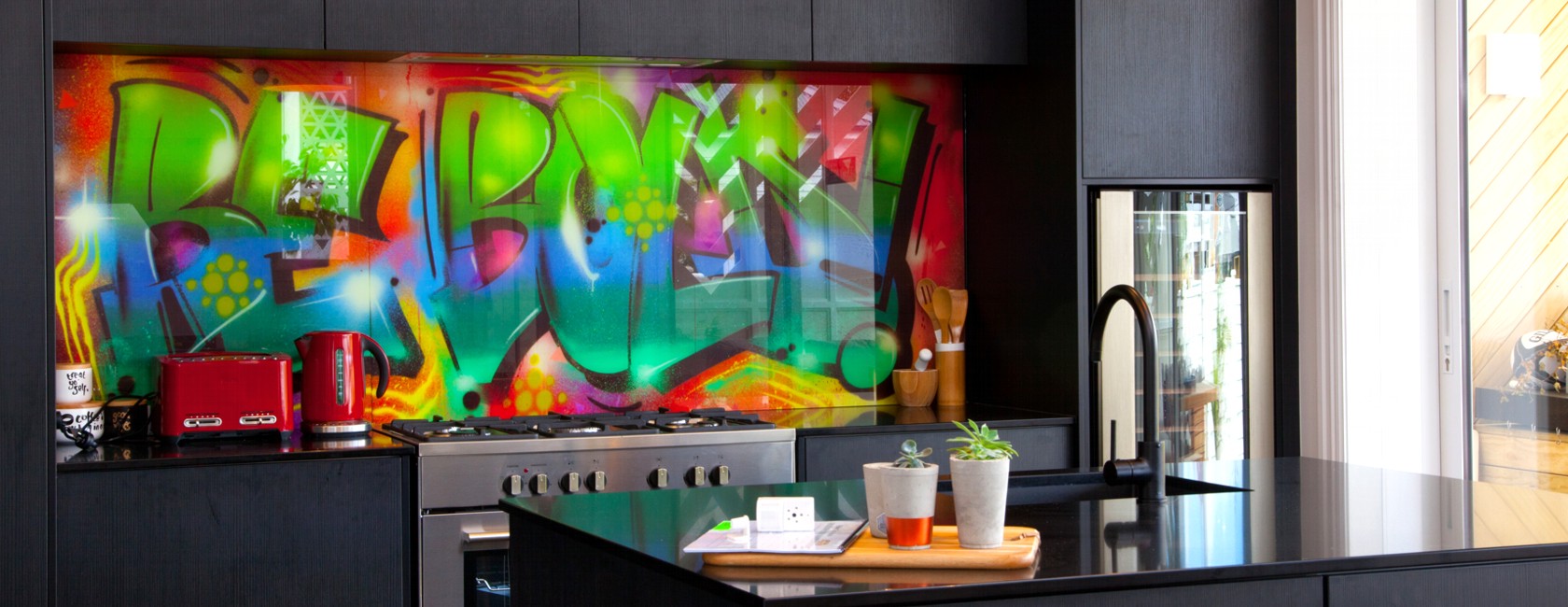
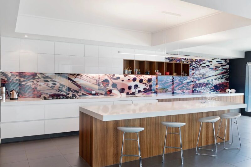
Wide panoramic images often work best because they suit the horizontal shape of most splashback areas. Landscape photos, city skylines, marble patterns, and abstract textures tend to crop more naturally than tall portraits.
If you are using a repeating pattern, make sure the crop feels balanced. An uneven crop can make the design look accidental, especially if the pattern ends abruptly at the edges.
Print quality, finishes, and long term durability
The image can be perfect, but the finish still affects the final look. Glossy finishes make colours look richer and more vibrant, and they also reflect light strongly.
Matte finishes give a softer, more modern appearance and reduce glare. They can be a better choice if your kitchen has strong under cabinet lighting.
With printed splashbacks, it is also essential to consider heat and cleaning. If the splashback is placed behind a hob, it should be made from toughened safety glass or a heat rated material approved for that area.
Ask how the image is applied and protected. Many suppliers print on the reverse side of the glass, which keeps the image safe from scratches and cleaning chemicals.
Always confirm that cutouts for sockets are included in the template stage. Once glass is toughened, it cannot be drilled or cut without breaking, so accurate planning is critical.
Conclusion
Printed splashbacks can look stunning when the image is prepared correctly. Choosing the right resolution, planning the crop around sockets and cabinets, and selecting a suitable finish makes a major difference.
With careful preparation and good supplier support, you can create a splashback that feels custom, high quality, and perfectly fitted to your kitchen space.